


Work
Brand Maximisation™ in action


Request your free brand maximisation™ audit
Share your brand guidelines with us and we’ll show you how you could uncover new untapped potential with the brand you already have


Brand Maximisation™ in action
Share your brand guidelines with us and we’ll show you how you could uncover new untapped potential with the brand you already have
If you have a project in mind please get in touch. We’re always happy to chat.
Request your free brand maximisation™ audit
"*" indicates required fields
Thank you for your message.
A member of our team will be in touch shortly
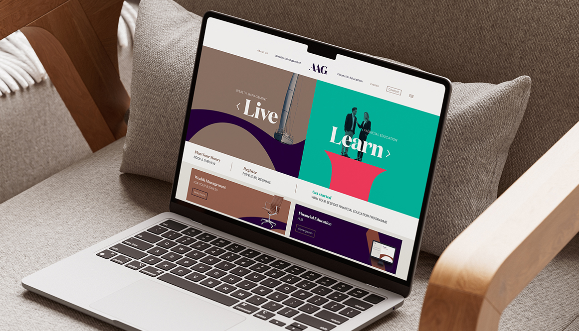
We helped AAG Wealth Management modernise their identity to reflect the business they’d already become – confident, contemporary and built to support multiple services under one trusted name.
Founded in 1995 and part of the St. James’s Place network, AAG has built an award-winning reputation in wealth management.
As the business expanded into mortgages, insurance and Financial Education, the brand needed to keep pace with its ambition and breadth. A brand refreshed, not replaced.
Crest retired in favour of a cleaner, digital-first logotype
Contemporary serif introduced to retain gravitas without feeling dated
Flexible visual language built from the logo itself
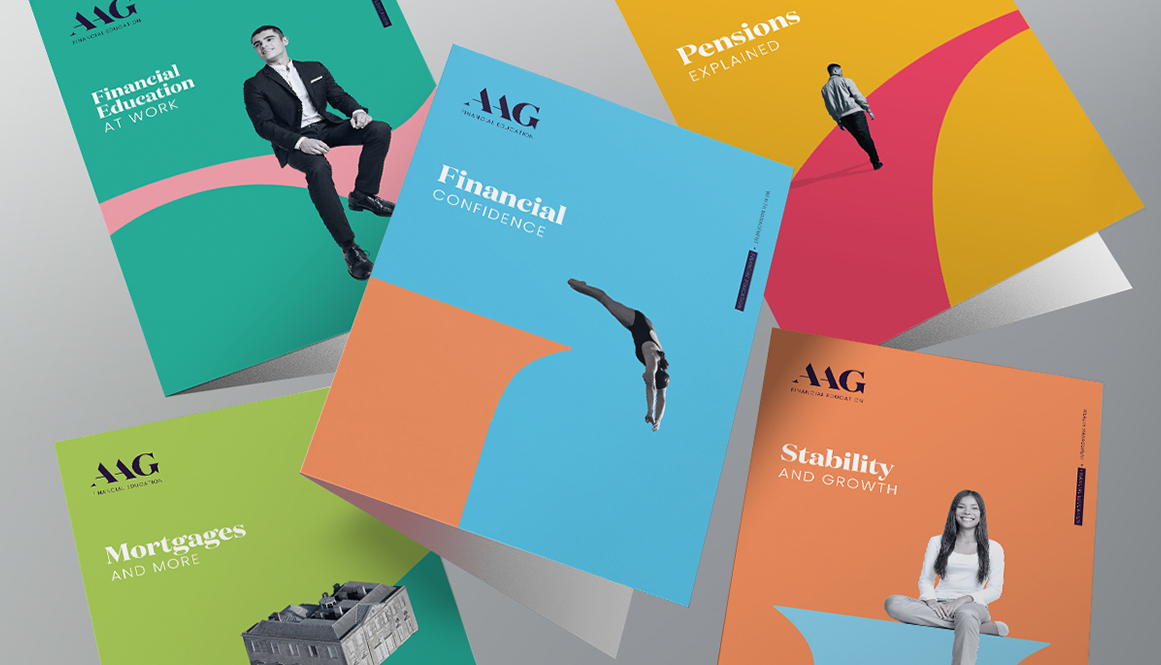
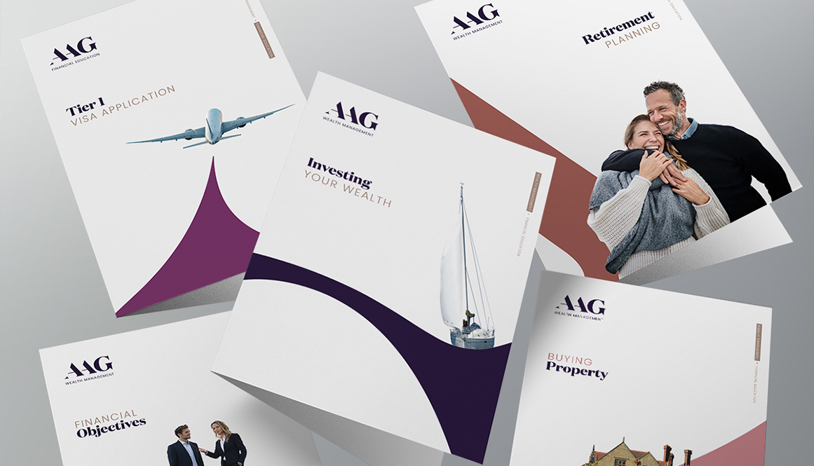
Clear colour structure to support multiple service lines under one brand
Research and stakeholder feedback revealed a clear issue: the lion-and-shield crest felt old-fashioned, was difficult to use at small sizes, and didn’t reflect AAG’s friendly, family-first approach. Combined with dated typography, the brand no longer matched the energy or confidence of the business.
The challenge was to modernise without losing trust — evolving the brand without erasing the equity built over decades.
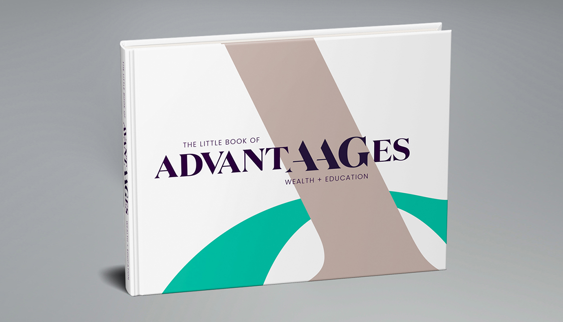
Rather than starting from scratch, we focused on what already worked. AAG is short, distinctive and inherently typographic — the perfect foundation for a brand system that could do more.
We removed the crest to create a cleaner, more legible logotype aligned with SJP’s modern, digital-first direction. Refining the letterforms — including opening up the ‘A’ — improved balance, clarity and confidence.
A contemporary serif (Domaine Display) replaced the Garamond-style typography, retaining a sense of gravitas while improving legibility and relevance across digital channels.
Crops and deconstructions of the logotype became graphic devices, forming an ownable visual language that positions AAG as an enabler and partner — not a distant institution.
A considered colour strategy allowed Wealth and Mortgages to retain more heritage tones, while Financial Education could use brighter, more uplifting colours — all within one cohesive brand.
AAG didn’t need to change who they were, they just needed a brand that looked like who they’d already become.
Want to evolve your brand without losing the trust you’ve earned? Let’s talk.