

Work
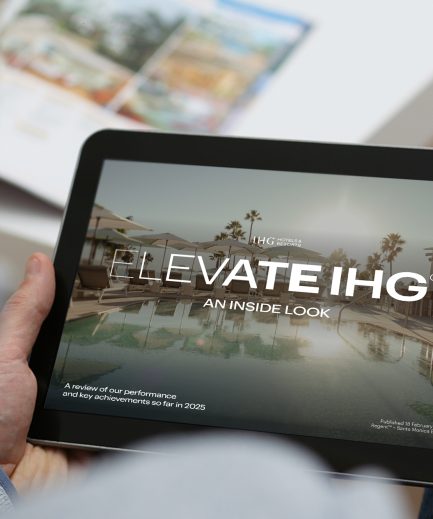
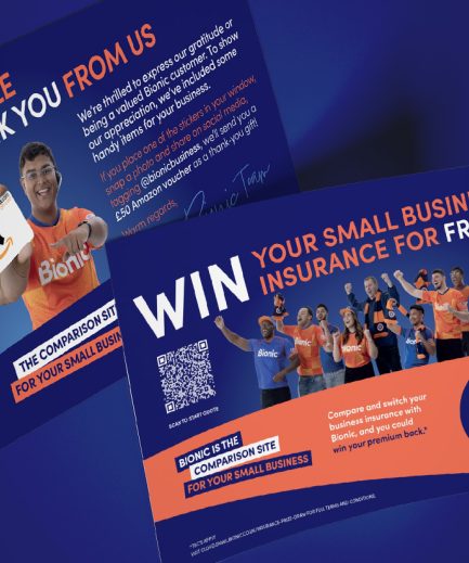
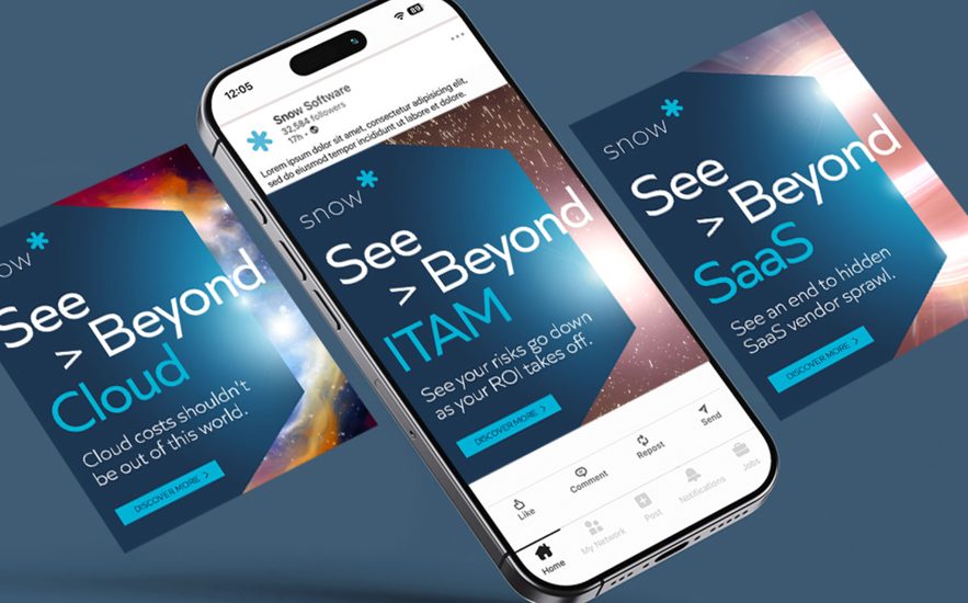
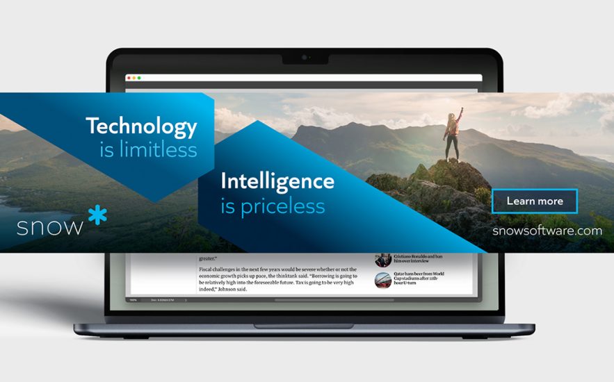
Brand Maximisation™ in action


Request your free brand maximisation™ audit
Share your brand guidelines with us and we’ll show you how you could uncover new untapped potential with the brand you already have


Brand Maximisation™ in action
Share your brand guidelines with us and we’ll show you how you could uncover new untapped potential with the brand you already have
If you have a project in mind please get in touch. We’re always happy to chat.
Request your free brand maximisation™ audit
"*" indicates required fields
Thank you for your message.
A member of our team will be in touch shortly
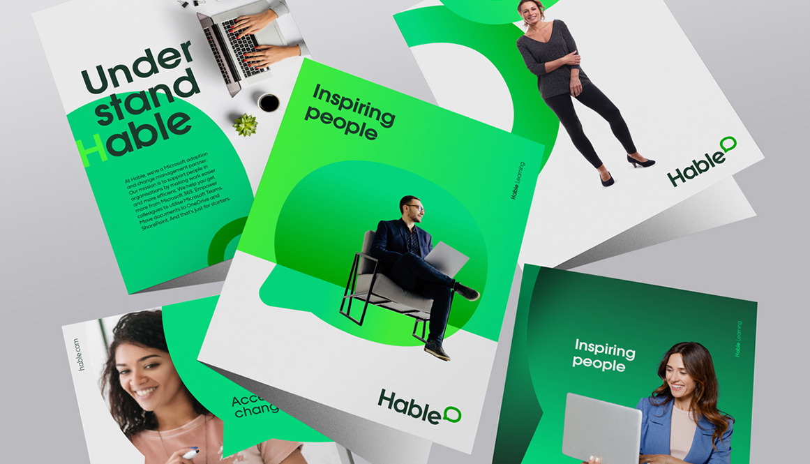
We helped Hable evolve their brand into a clearer, more confident system — one that reflects their maturity, sharpens their value proposition, and works as hard as the technology they help deliver.
Hable is a leading Microsoft adoption and change management partner, helping organisations make work easier and more efficient.
As the business matured, their brand needed to do more — showing up with greater consistency, clarity and confidence across every touchpoint.
Refreshed identity with improved clarity and enterprise confidence
Accessibility-first colour system achieving a 96% website accessibility score
Simplified logo architecture with a more ownable brand device
Flexible visual system built for digital, campaign and sector use
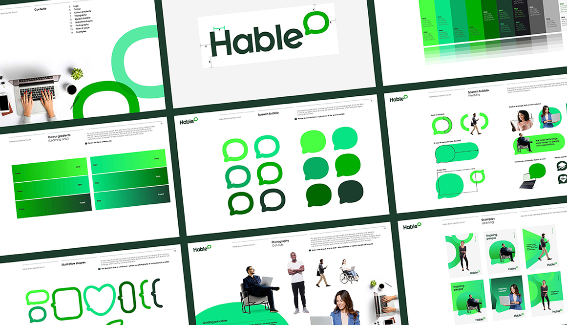
Hable’s existing identity had strong foundations, but too many elements were competing for attention. The logo architecture was cluttered at small sizes, typography leant towards friendly at the expense of authority, and the brand lacked a clear, consistent system as the business scaled.
Accessibility wasn’t a tick-box — it was a design driver. Every decision needed to work harder for real people, across real environments.
Rather than reinventing the brand, we amplified the assets that were already theirs — and rebuilt them into a modern, scalable system.
Green was already a strong differentiator in a crowded category. We refined Hable’s core green and expanded it into an accessible palette, engineered for legibility and flexibility — including variants that achieve ‘AAA normal’ contrast with black text.
We simplified the logo and elevated the speech bubble into a true brand device. Flexible, recognisable and versatile, it can be outlined or filled, reshaped for recognition, and used to hold messaging, imagery, iconography and sector cues.
We introduced a cleaner, more enterprise-ready typeface with improved balance and clarity — retaining approachability while adding authority and presence across digital and physical formats.
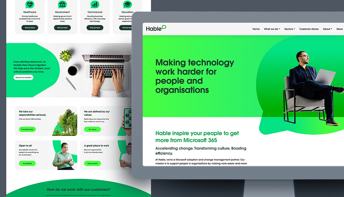
The result is a refreshed identity and system built for clarity, consistency and cross-channel use — from campaigns and comms to sector differentiation across Government, Commercial, Education and Healthcare.
A brand that makes work easier
Hable’s mission is to simplify work through technology. This refresh ensures their brand does exactly that — clearer, more consistent, more accessible, and ready for the next stage of growth.
Want your brand to work harder without losing what makes it distinctive? Let’s talk.